Nike G.T. Cut 3 Retail
Client — Nike
Agency — Plastic Sunshine
Role — Environment Design
Background
With the launch of their latest basketball shoe, the G.T. Cut 3, Nike needed a comprehensive global directive that would be used as a guide for buildouts across the retail spectrum — from full takeovers in pinnacle stores to smaller footprints in regional areas.
Project
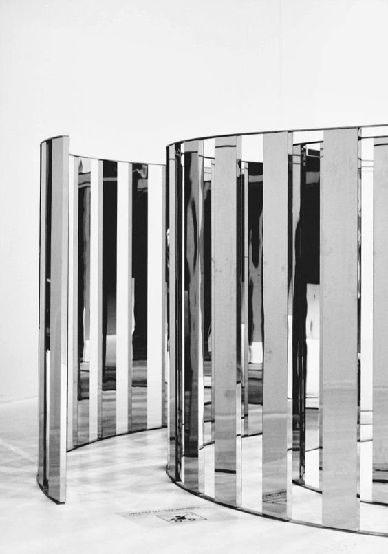
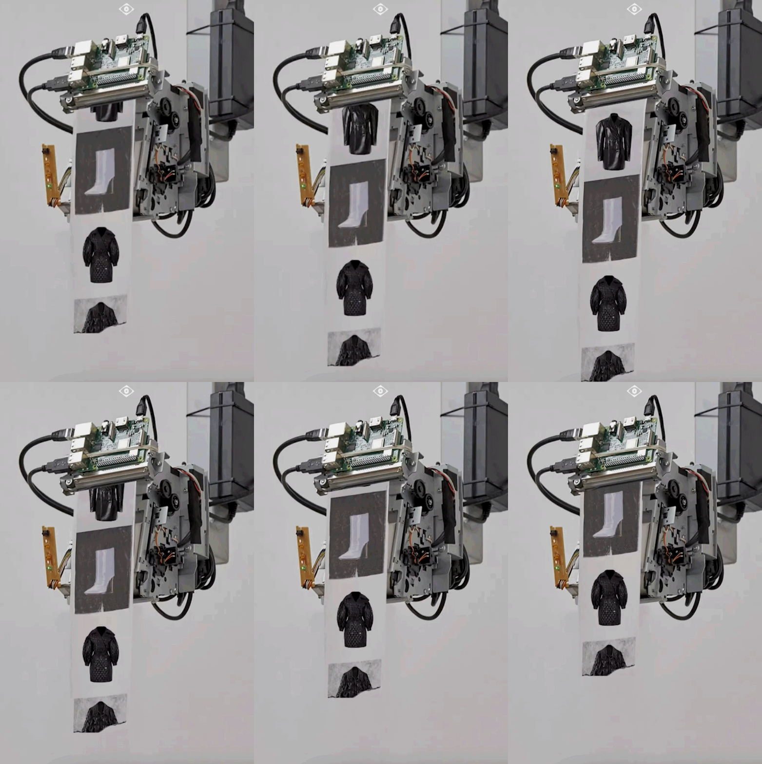
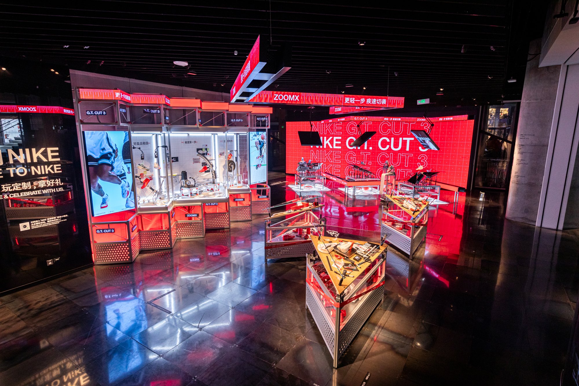
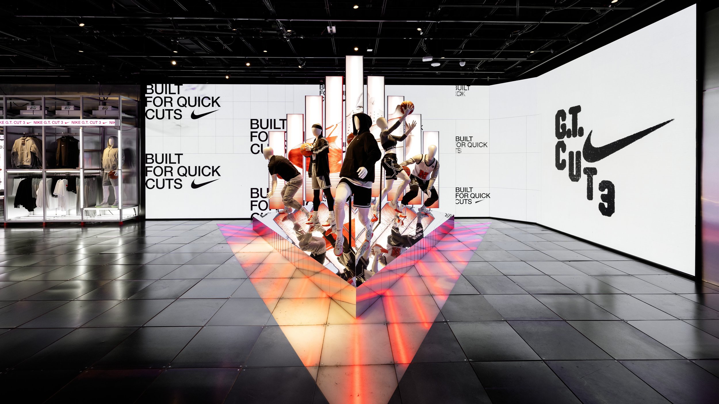
I partnered with Plastic Sunshine to develop the retail design for the G.T. Cut 3 campaign. The direction we created highlighted the new footwear innovations: traction, fit and responsiveness. We utilized the build and materiality to showcase these benefits, such as angular forms, reflective surfaces and automated elements to stimulate real-time measuring devices.
The final retail directive included flexible systems for windows, interior displays and fixtures to guide retailers in showcasing consistent creative at any size or scale.
Last Thoughts
This was a good exercise in pushing the limit on both sides of the spectrum. On one end, you’re creating the highest level, most pinnacle expression at retail. On the other end, you’re finding ways to scale the design but keeping it elevated and premium. It was an overarching study in retail realities ☺
Inspiration
Windows & Interior — Elevated
Windows & Interior — Scaled
Final executions (For Reference)
Nike House of Innovation — China & New York


