Sword Health Booth
Client — Sword Health
Agency — Plastic Sunshine
Role — Environment Design
Background
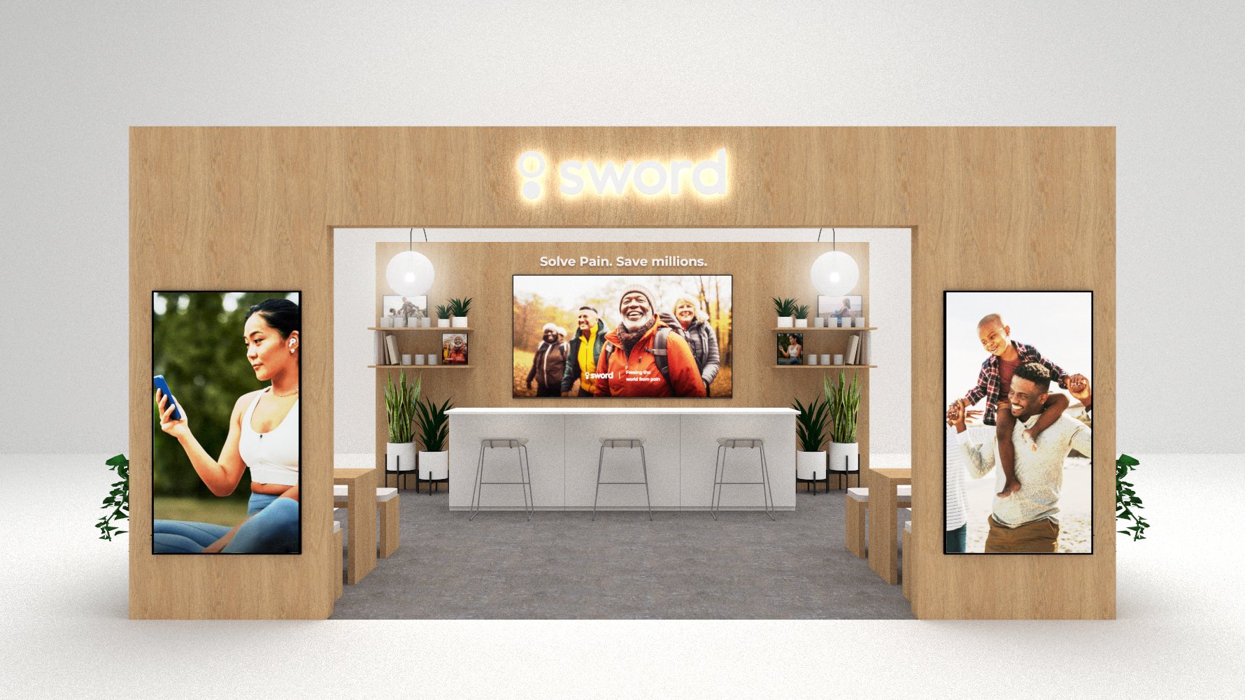
Sword Health is a healthcare company that provides accessible physical therapy resources through digital platforms. Their booth was in need of a refresh that would reflect the brand’s approachable and modern ethos.
Project
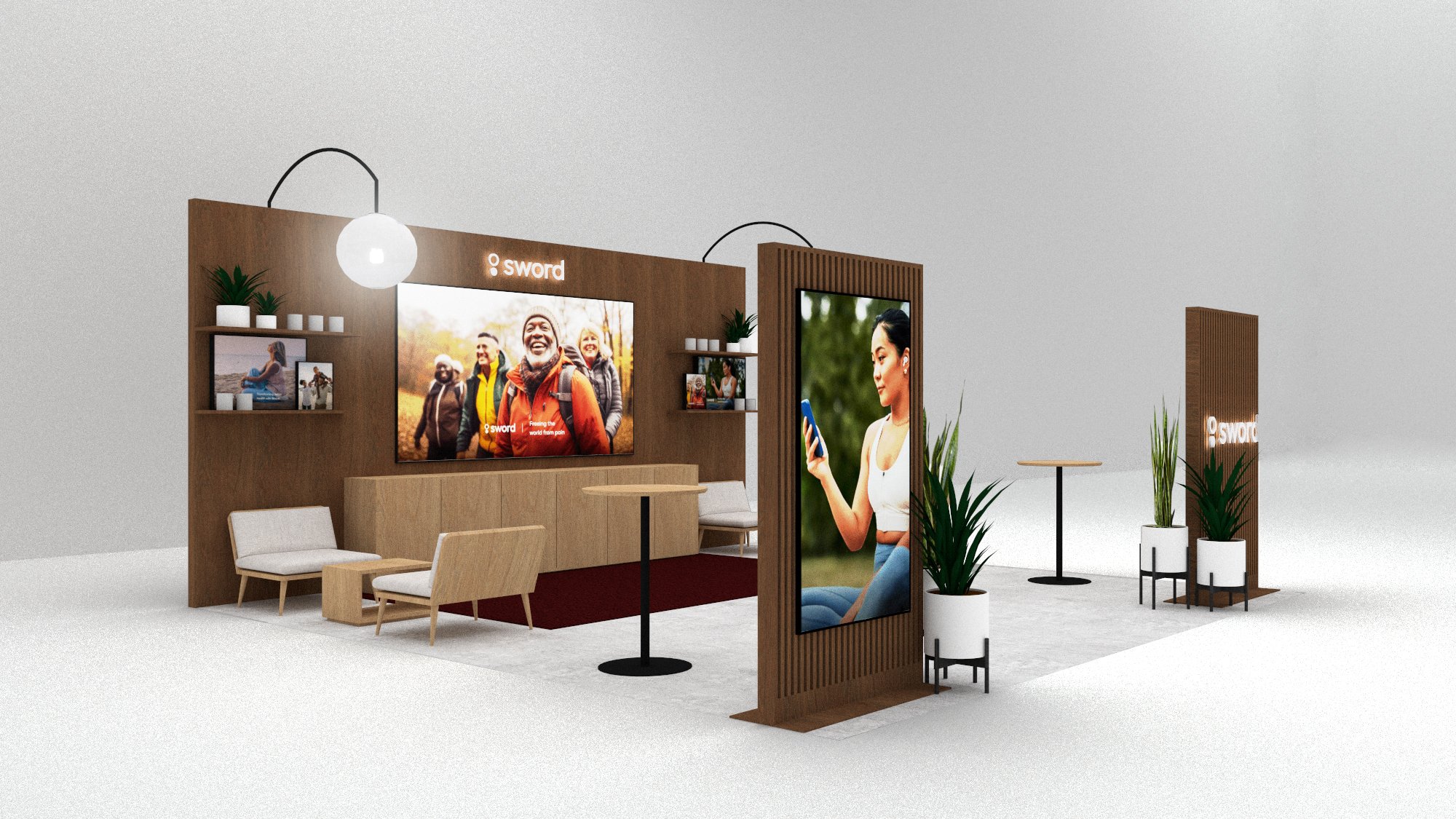
I worked with Plastic Sunshine to design a modular experience that would accommodate all of the upcoming shows and footprints for the next three years. The booth was designed to stand out within the healthcare landscape through warm, welcoming materials while allowing space for products, branding, meeting spaces and storage areas.
Last Thoughts
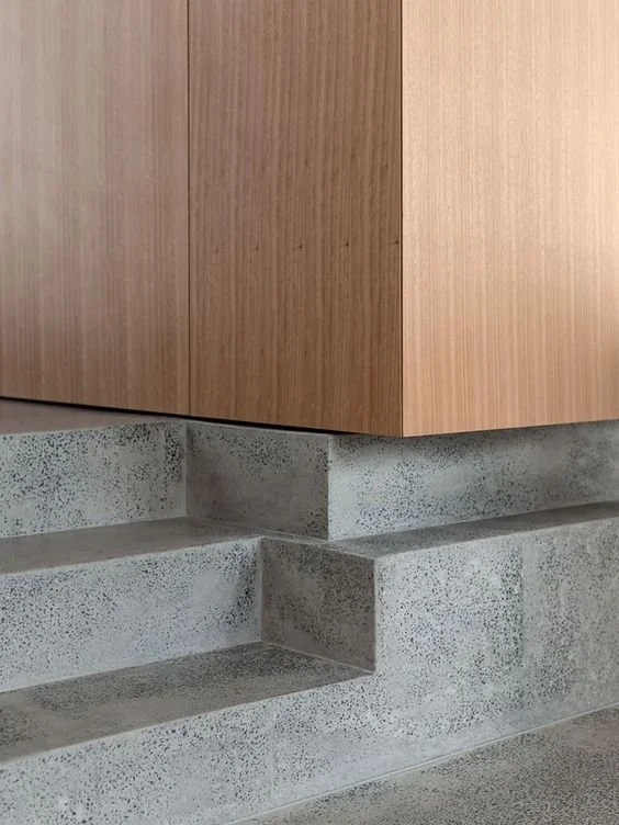
Booths are a challenge because they need to fulfill a lot of requests within a small amount of space — it’s a balance of aesthetics and logistics, bringing you back to the core of good design. I appreciated the chance to study different forms and textures within a typically stark field, bringing in some warmth and completely transforming the original build.
Design Exploration
Concept 01 — Simple Modern
Clean lines, greenery, textile accents
Concept 02 — Color Pop
Color emphasis, simple fixtures, wood finishes
Concept 03 — Living Room
Tactile materials, comfortable textiles, rich hues
Additional Studies
Final Delivery


